
- Goal: launch, gift purchase, category comparison, accessory attachment, seasonal sell-through, or another measurable result.
- Hero product: the item shoppers should notice first.
- Core range: enough options to cover real differences without filling the fixture with near-duplicate SKUs.
- Decision information: age, price, difficulty, size, contents, compatibility, batteries, apps, or other required items.
- Demo: show the finished result or let shoppers test the product only when it helps them understand it.
- Stock: calculate how long the fixture can stay full before staff must refill it.
- Measurement: track category sales, sell-through, attachment rate, basket value, margin, and stock-outs.
Give the Display One Sales Job
Start with the result you want from the space. A launch display, a gift table, and an accessory section should not be built the same way because the shopper is trying to solve a different problem in each case.
| Display Goal | What Shoppers Need to See | What to Measure |
|---|---|---|
| New product launch | Main function, age, price, contents, finished result | Product sales, category sales, demo use |
| Gift display | Age, budget, interest, difficulty, whether the product is complete | Display sales, basket value, customer questions |
| Accessory display | Compatibility, required vs optional items | Attachment rate |
| Seasonal display | Fast product selection, stock availability, clear price | Sell-through, stock-outs, remaining stock |
| Category display | Differences between beginner, standard, advanced, small, large, or feature levels | Category sales, product mix, customer questions |
Seasonal ranges need one extra check: stock. Display size should make sense for the quantity you have, the lead time for reorders, expected sales, and the stock you are willing to keep after the season ends. The same numbers used for holiday toy inventory planning should affect how much selling space the range receives.
A small fixture should not try to handle a launch, clearance promotion, gift guide, complete category range, and accessory program at the same time. Pick the job that matters most and give the space to that job.
Build the Product Mix Around the Buying Decision
Every SKU on the display should have a reason to be there. If two products do the same job for the same shopper and the difference is hard to explain, they may not both deserve equal space.
| Product Role | Purpose | Example |
|---|---|---|
| Hero | Gets the first look | Main building set |
| Core | Provides meaningful choices | Beginner, standard, advanced sets |
| Add-on | Completes or extends the purchase | Extra pieces, storage, refill pack |
The hero product needs to be easy to understand, relevant to the display goal, visually clear, and backed by enough stock. The highest-priced item is not automatically the best choice.
Core products are there to give shoppers real options. A beginner, standard, and advanced set make sense together because each one serves a different level of user.
Add-ons should follow the same logic. Extra train track belongs beside a train set because it extends the same play system. A random toy placed there only to fill a gap does not help the customer.
This same discipline matters when selecting educational toys for a retail assortment: each SKU should cover a useful customer need instead of duplicating products already on the shelf.
Group Products by the Way Customers Search
Shoppers do not always think in supplier names or brand structures. Some start with age, some with price, and others with a child’s interest. Use the grouping that matches the way people are actually looking for the product.
| Grouping Method | Best Used When | Examples |
|---|---|---|
| Category | Shopper already knows the toy type | Games, dolls, building toys |
| Age | Shopper knows the child’s age first | Ages 3–5, Ages 6–8 |
| Interest | Interest drives the purchase | Dinosaurs, space, animals |
| Activity | Shopper is choosing how the child will play | Build, create, explore, pretend |
| Price | Budget is the first filter | Gifts Under $20 |
Activity-based ranges such as Dig & Explore, Fun & Science, Earth & Space, Arts & Crafts, and Sensory & Learning are useful when customers begin with the type of activity rather than a specific product name.
Clear grouping also reduces the amount of comparison work. If 36 gift products are divided into six clear age or price groups, each group contains about six choices. If all 36 products are mixed together, the shopper has to sort through the full range before deciding.
Use Age as a Filter, Not a Store-Made Safety Rating
Age sections are useful for navigation. They are not a replacement for the age guidance on the actual product.
- 0–2 Years: age-appropriate early-play and sensory products;
- 3–5 Years: age-appropriate pretend play, simple construction, and creative activities;
- 6–8 Years: suitable games, science activities, building sets, and crafts;
- 9+ Years: more detailed activities, strategy games, hobbies, and advanced construction.
These are merchandising examples only. Use the specific product’s manufacturer age guidance when presenting the toy. The U.S. Consumer Product Safety Commission advises consumers to follow age guidance and safety information on toy packaging.[1]
Difficulty may still need its own label. Two products can both carry an 8+ age label while requiring very different levels of patience, reading, assembly, or previous experience.
- Ages 8+ | Beginner
- Ages 8+ | Experienced Builder
Match the Fixture to the Product
Choose the fixture by looking at what the shopper needs to do: compare, touch, test, or simply notice the product from a distance.
| Fixture | Use It For | Avoid |
|---|---|---|
| Feature table | Small comparison range, gift collection, finished examples | Covering every part of the table with boxes |
| Endcap | Promotion, launch, seasonal range, one product family | Unrelated overflow stock |
| Wall display | Large ranges with size, theme, price, or difficulty choices | One continuous wall with no clear sections |
| Demo station | Products that need touching, testing, or showing | Demos that block normal customer movement |
| Window display | One visual idea visible from a distance | Trying to show the complete range |
A large table is rarely the best use of space for tiny collectibles. A complex interactive product may need more room than a standard wall bay provides. Use the fixture that makes the product easiest to understand and buy.
Calculate SKU Density Instead of Filling Every Gap
Before adding another SKU, look at the space already being used. Variety, facings, and stock depth affect the shelf in different ways.
- Variety: number of different SKUs.
- Facings: visible fronts of the same SKU.
- Stock depth: units held behind or below the visible products.
A 1-meter shelf has 100 cm of horizontal space.
| Example | SKU Count | Average Width per SKU |
|---|---|---|
| High variety | 20 | 5 cm |
| Focused range | 8 | 12.5 cm |
The numbers are examples, not shelf standards. Package width, actual demand, category role, and replenishment frequency determine the real allocation.
Facings also change how often staff need to refill. If one facing holds three units and the product sells nine units on a busy day, one facing may need three refills. If three facings fit, the shelf can hold all nine units at once.
Space should follow demand and product role. A large quantity in the stockroom is not a good reason to give a weak SKU more shelf space.
Make the Visual Order Obvious
Someone standing in front of the display should know where to look first without studying the whole fixture.
- First look: hero product or main theme.
- Second look: main product choices.
- Third look: age, price, difficulty, size, and other comparison information.
- Fourth look: related accessories.
The vertical space can also do different jobs.
| Area | Best Use |
|---|---|
| Upper area | Category, brand, or theme marker |
| Main viewing area | Hero products, important choices, comparison information |
| Lower area | Large boxes, heavier products, safe child-visible items, stock depth |
“Eye level is buy level” is too simple for a toy store. Adults and children look at different heights, and shelf placement also has to account for weight, loose parts, and safe handling.
Show the Part the Box Cannot Explain
Do not use display space to repeat information that is already obvious on the package. Use it to show what shoppers cannot easily picture.
| Toy Type | What to Show |
|---|---|
| Building set | Finished model, size, moving parts, alternative builds |
| Board game | Player count, play time, basic goal, board or components |
| Electronic toy | Main action, batteries or charging, app/internet requirements |
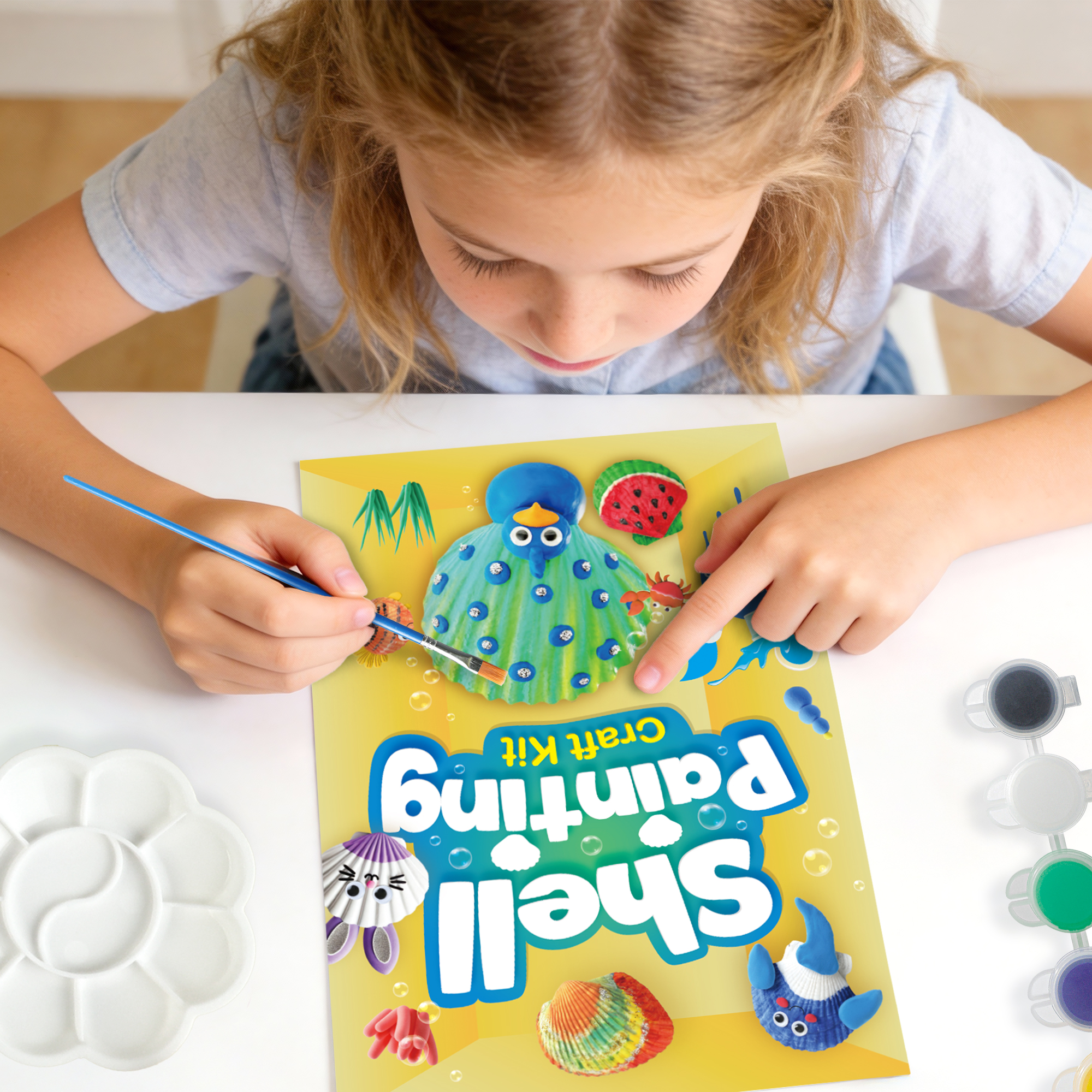
| Craft kit | Finished project, included materials, supplies needed separately |
| Large playset | Assembled size, storage size, play space |
| Excavation kit | Starting block and finished specimens |
A dinosaur fossil dig kit with displayable fossils can be shown with the unopened excavation material and the finished fossil display.
A gemstone excavation kit with 18 specimens can be shown with the excavation block and examples of the stones found inside.
Large products often need more than one size figure.
- Package size: transport and gift wrapping.
- Finished size: permanent space needed after assembly.
- Play space: extra floor area needed while the toy is being used.
A dollhouse may be 80 cm wide but still require clear floor space in front. A train set may fit in a small box while using a much larger floor area when assembled.
Use Interactive Demos Only When They Add Information
A demo earns its space only if it helps the shopper understand something important.
- Easy to start: shoppers understand it without a long explanation.
- Easy to reset: staff can restore it quickly.
- Easy to maintain: parts do not constantly disappear or break.
Some products are better shown through the finished result. A glow-in-the-dark crystal-growing kit, for example, can be displayed beside a completed crystal instead of keeping an experiment running in the store for several days.
Remove demos that are:
- broken;
- dirty;
- missing important parts;
- leaking;
- no longer operating correctly.
Sound needs control too. Shopper-activated buttons and automatic time-outs can stop several talking or musical toys from running together all day.
Put Buying Information on the Front
Show the facts people normally have to hunt for on the side or back of the box.
| Product Type | Useful Display Information |
|---|---|
| Board game | Age, players, play time, difficulty |
| Building set | Age, pieces, finished size, difficulty, possible builds |
| Electronic toy | Batteries, charging, app requirement, internet requirement |
| Craft kit | Finished project, included materials, extra supplies |
| Large toy | Dimensions, assembly, storage, manufacturer limits where relevant |
A useful building-set sign could contain only:
Ages 5+
Builds 4 Models
120 Pieces
No Batteries Needed
$24.99
Vague claims are less useful than specific facts. Replace “Boosts Intelligence” with “Includes counting and matching activities.” In the United States, the FTC requires advertising to be truthful and not deceptive, and objective claims need appropriate support.[2]
Make Price Differences Easy to Justify
When products sit next to each other, the shopper should be able to see what the extra money buys.
| Product | Price | Difference |
|---|---|---|
| Starter Set | $19.99 | Basic set for first-time users |
| Builder Set | $34.99 | More pieces and build options |
| Deluxe Set | $59.99 | Extra figures and storage case |
These prices are hypothetical.
The Builder Set costs about $15 more than the Starter Set. The Deluxe Set costs another $25 above the Builder Set. The display should show what the customer receives for each extra amount.
- more pieces;
- larger finished size;
- more functions;
- extra figures;
- storage;
- additional build options;
- broader compatibility.
Piece count is not a quality score. A 120-piece beginner set may be a better fit for one shopper than a 240-piece advanced set.
For promotional pricing, identify whether the price covers one item, selected SKUs, or a complete bundle. Accessories shown beside the main product should not look included if they are sold separately.
Separate Required Items from Optional Add-Ons
Put related products together, but make the relationship clear. The shopper needs to know what is necessary and what is simply an extra.
| Type | Meaning | Examples |
|---|---|---|
| Required | Needed for normal use | Batteries, starter set, essential refill, required base product |
| Optional | Extends the experience | Extra track, extra figures, storage, expansion pack |
Attachment rate gives you a simple way to see whether the add-on placement is working.
If 40 train sets are sold and 12 buyers also buy extra track:
12 ÷ 40 = 30% attachment rate.
If the next comparable group of 40 train-set buyers produces 16 extra-track purchases:
16 ÷ 40 = 40% attachment rate.
The increase does not prove the display caused the result by itself, but it gives the retailer a number that can be tested against other periods.
Use Color and Lighting to Separate Products
Toy packaging is already visually busy. Store color should help shoppers separate areas, not make every shelf louder.
- category markers;
- seasonal areas;
- promotions;
- navigation.
A store might use green for STEM, yellow for creative products, blue for games, and red for offers. These colors are examples only. Use one meaning consistently.
Before opening, look at the display from the customer side and check for:
- dark lower shelves;
- strong shadows;
- glare on glossy packaging;
- screen reflections;
- spotlights covering important text.
A hero item may need stronger lighting. Comparison shelves usually need even light so people can read every option properly.
Calculate How Long the Display Can Stay Full
Use the sales rate to decide whether the fixture can hold enough stock between refills.
Display stock ÷ average daily unit sales = approximate days of display stock.
If a fixture holds 12 units and sells about eight units per day:
12 ÷ 8 = 1.5 days of stock.
If staff refill only every two days, the fixture can become empty before the next scheduled refill.
Possible fixes:
- add facings;
- increase stock depth;
- keep backup stock closer;
- check the fixture more often.
Stock-out time matters too.
If a product is out of stock for three hours during a 10-hour trading day:
3 ÷ 10 = 30% of that day’s selling time unavailable.
Low sales during that day cannot be interpreted correctly without considering the stock-out.
Seasonal space should shrink with the remaining stock. If the products can fill one meter properly, do not spread them across a partly empty two-meter display.
Reset the Display Every Day
A display changes as soon as customers start touching it. Give staff a short reset routine instead of waiting until the fixture looks bad.
| Time | Check |
|---|---|
| Opening | Stock, prices, facings, damaged boxes, demos, signs, clear routes |
| During trading | Empty hooks, misplaced products, messy tables, broken demos |
| Closing | Refill, cleaning, next-day promotion changes, product moves |
Do not move an unrelated SKU into an empty gap simply to make the shelf look full. Keep the grouping logic intact.
Keep Customer Routes and Fixtures Safe
Stock boxes, promotional baskets, endcaps, and temporary displays should stay out of the customer route.
For U.S. businesses, ADA guidance says an accessible route through a business must generally be at least three feet, or 36 inches, wide and should not be blocked by merchandise, display racks, or furniture.[3]
The 2010 ADA Standards also contain requirements for accessible routes, check-out aisles, and sales and service counters.[4]
These are U.S. requirements. Use the rules that apply to the store’s actual country and location.
Toy fixtures also need a physical safety check:
- heavy boxes that can fall;
- loose cords;
- sharp or protruding fixture parts;
- unstable shelves;
- broken demos;
- small loose parts;
- button or coin batteries;
- loose or high-powered magnetic parts.
U.S. toy-safety requirements include the mandatory ASTM F963 toy standard for products within its scope.[5]
U.S. small-parts rules address choking, aspiration, and ingestion risks for products intended for young children, with warning requirements applying to certain other products containing small parts.[6]
CPSC warns that swallowed button or coin batteries can cause severe internal injury.[7]
CPSC also warns that swallowed high-powered magnets can attract to each other inside the body and cause serious internal injuries.[8]
Keep manufacturer warnings visible. Do not cover them with price labels, security devices, shelf strips, or promotional cards.
Remove recalled stock and affected demo units from sale. U.S. federal law prohibits the sale of recalled consumer products.[9]
Measure Sales, Stock, Basket and Margin Together
One number rarely tells the whole story. Use the metric that matches the display goal, then check the surrounding numbers before deciding whether the change worked.
| Metric | Calculation or Use |
|---|---|
| Product sales | Units or revenue from the featured SKU |
| Category sales | Total result across the relevant category |
| Sell-through | Units sold ÷ starting available units |
| Attachment rate | Add-on purchases ÷ main-product purchases |
| Average basket value | Total transaction revenue ÷ transaction count |
| Gross margin | Sales revenue minus product cost before other operating costs |
| Stock-out time | Hours unavailable ÷ trading hours |
Sell-through example: 65 units sold from 100 available units equals 65% sell-through.
A second product that sells 30 units from 40 available units has 75% sell-through, even though it sold fewer units in absolute terms.
Basket example: $800 from 20 transactions equals a $40 average basket value. If 20 comparable transactions later produce $920, the average becomes $46, a 15% increase.
Margin example: suppose a toy costs the retailer $15 and sells for $30.
- 20 units × $30 = $600 revenue.
- 20 units × ($30 − $15) = $300 gross margin before other costs.
If the selling price falls to $24 and unit sales rise 20%, from 20 to 24 units:
- 24 × $24 = $576 revenue.
- 24 × ($24 − $15) = $216 gross margin before other costs.
Units increased 20%, while both revenue and gross margin fell in this simplified example.
Check Whether the Display Created New Sales
A featured item can look successful while the category as a whole stays flat.
| Toy A | Toy B | Total Category Units | |
|---|---|---|---|
| Before | 20 | 20 | 40 |
| After | 35 | 5 | 40 |
Toy A increased from 20 to 35 units:
(35 − 20) ÷ 20 = 75% growth.
But total category volume stayed at 40 units. The display may only have moved customers from Toy B to Toy A.
Check these numbers together:
- featured SKU sales;
- total category sales;
- related-product sales;
- basket value;
- gross margin.
Use Customer Questions as Display Data
Repeated questions are often a sign that the shelf is missing information.
- Does this need batteries?
- Is this suitable for a 4-year-old?
- Which one is easiest?
- Is everything included?
- Does this work with the set we already have?
Behavior can tell you the same thing without a customer saying a word.
- shoppers pick up the same product and put it back;
- they repeatedly turn the box over;
- they search around the shelf for a price;
- they compare the same two products for a long time;
- they return products to the wrong section.
If many shoppers turn the same package over before returning it, check whether the front of the display is missing age, price, size, contents, batteries, or compatibility information.
Test One Main Change at a Time
If you change the layout, price, promotion, stock level, and product range together, the result tells you very little about which change mattered.
- Record the current result.
- Change one main factor.
- Keep price, promotion, stock, and range as stable as practical.
- Compare similar trading periods.
Possible tests:
- hero-product position;
- SKU count;
- grouping method;
- price placement;
- demo versus no demo;
- accessory location.
Seven normal trading days before and seven comparable days after a change can provide a more useful comparison than one Monday versus one Saturday. Seven days is an example, not a required test period.
If Saturday normally produces twice Monday’s sales, day-of-week differences must be considered before attributing the change to the display.
Apply the Numbers to a Building-Toy Display
Here is how the same decisions fit together in one display.
| Set | Age | Pieces | Main Use |
|---|---|---|---|
| Beginner Set | 5+ | 80 | One simple model |
| Builder Set | 6+ | 140 | Three build options |
| Advanced Starter Set | 7+ | 220 | More detailed build |
These figures are hypothetical examples, not product-age or piece-count standards.
- Hero: one starter set with enough inventory and one finished demo model.
- Core range: three clearly different difficulty levels.
- Add-ons: only compatible wheels, pieces, or storage.
- Information: manufacturer age guidance, difficulty, pieces, finished size, compatibility.
- Stock: if the hero sells six units per day and the display holds nine, coverage is 9 ÷ 6 = 1.5 days.
- Measurement: starter-set sales, category sales, add-on attachment, stock-outs, and repeated questions.
Use Space Differently in Small and Large Stores
A small store cannot afford to give weak products permanent space. A large store has the opposite problem: plenty of space can make the range harder to navigate.
Small store: use fewer SKUs, flexible fixtures, compact gift groups, and products that justify their space.
For example, a 120 cm feature shelf could be divided as:
| Role | Width | Share |
|---|---|---|
| Hero | 48 cm | 40% |
| Core products | 54 cm | 45% |
| Add-ons | 18 cm | 15% |
This is an example allocation, not a standard. Actual space should follow package dimensions, demand, and display purpose.
Large store: use clear department markers, visible subcategories, consistent grouping, open sightlines, and repeated navigation where customers need it.
Check These 14 Points Before Opening the Display
- One clear display goal
- One obvious hero product
- Manufacturer age guidance visible
- Main product function clear
- Price easy to identify
- Contents clear
- Required extras identified
- Differences between core products easy to compare
- Demo clean and working
- Safety warnings unobstructed
- Fixture stable
- Customer route clear
- Enough stock and a refill plan
- One or more measurable performance metrics
Finally
Keep the display only if the numbers and customer behavior support it. A fixture holding 12 units and selling eight per day has 1.5 days of display stock. Twelve add-on purchases from 40 main-product sales give a 30% attachment rate. A product rising from 20 to 35 units has grown 75%, but if total category sales stay at 40 units, the display has not created category growth. Check product sales, total category sales, sell-through, basket value, gross margin, attachment rate, stock-outs, and repeated customer questions together. That gives you a much better picture than judging the display by appearance or one strong SKU.